Al-Ekhtyar Al-Amthal
A tourism business needed a mark that reads as trustworthy and directional (path / destination) without falling into the sector’s usual clichés — palm trees, planes, globes.
The Challenge
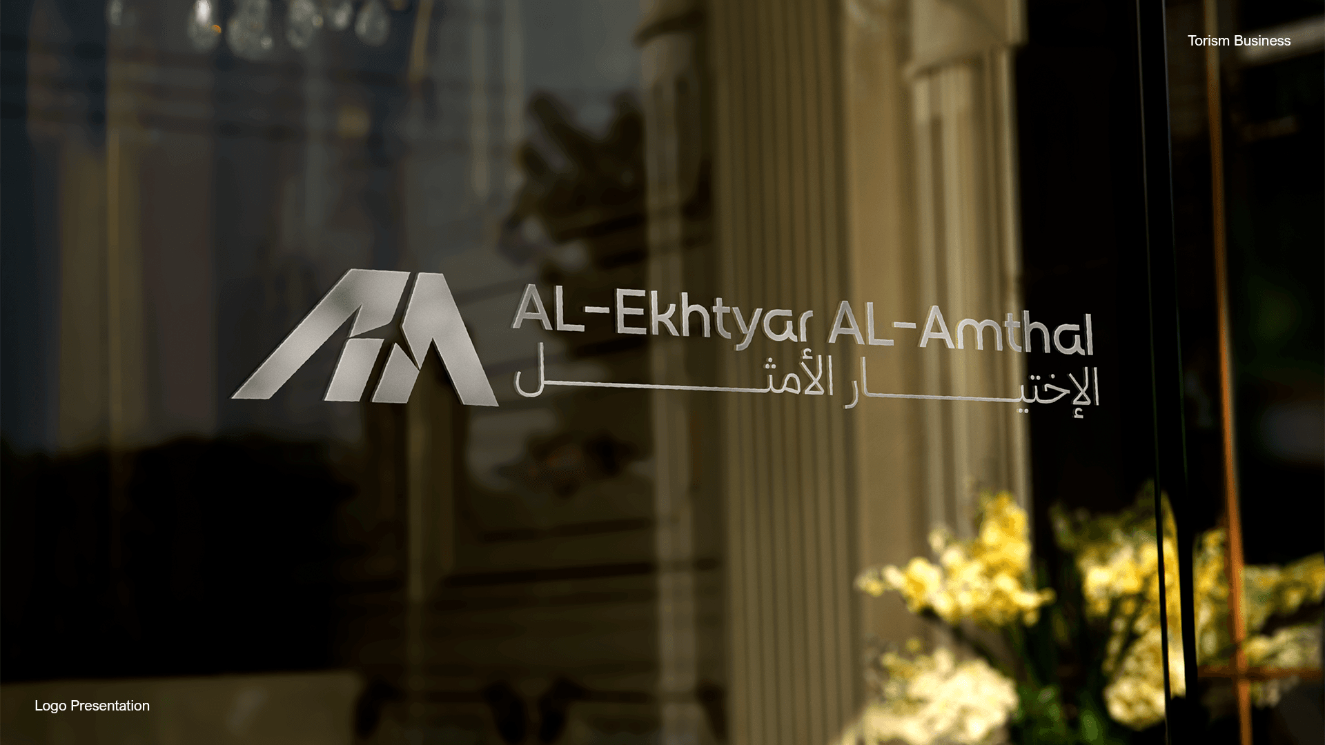
The challenge was building a two-letter monogram (A + A) that stands on its own as a legible mark, while carrying an implicit symbol (mountain / ascending path) without needing explanation — and supporting a full bilingual lockup, Arabic and English, in one system.
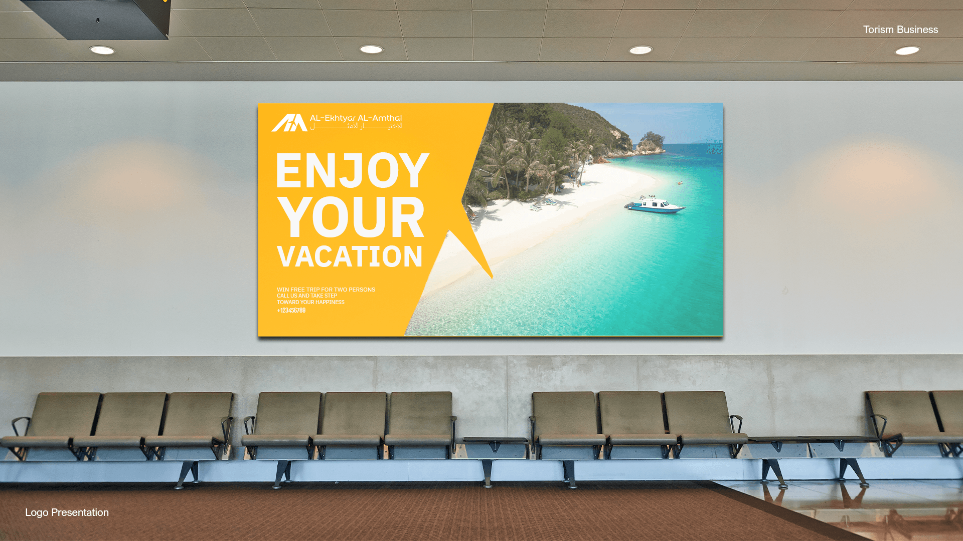
The Work
A closer look at the final deliverables.
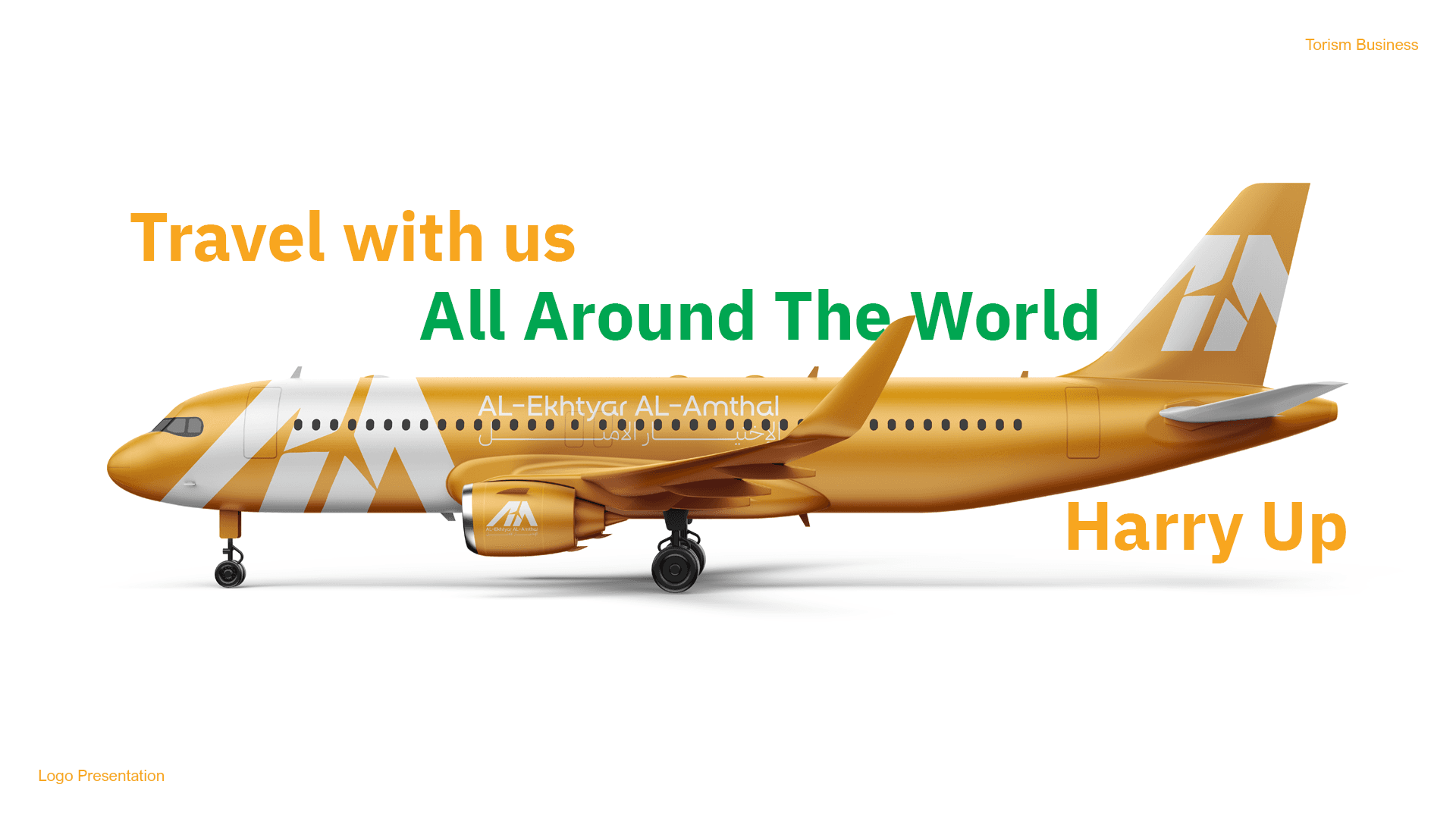
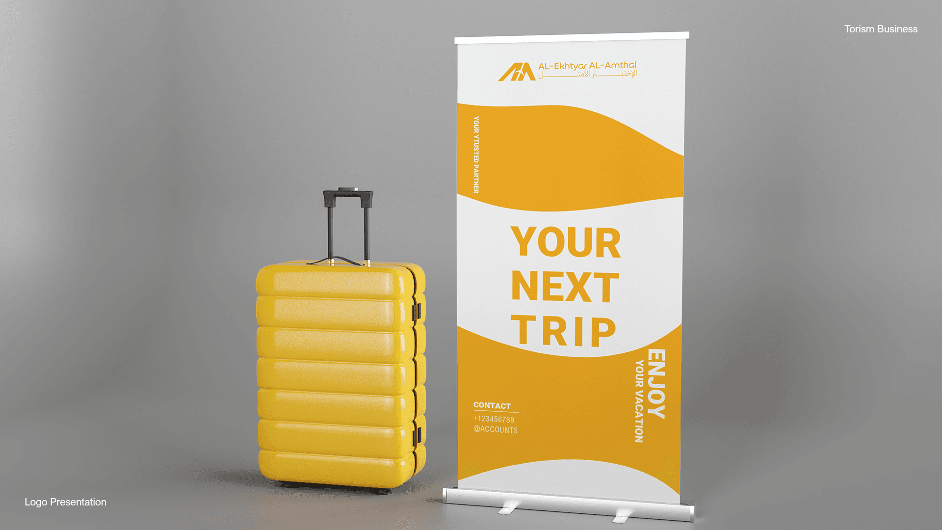
Approach & Execution
The mark was built as a simple geometric form suggesting a mountain or an upward path, in an energetic orange rather than the sector’s default blue. A bilingual lockup (Al-Ekhtyar Al-Amthal / الاختيار الأمثل) was designed to hold equal visual weight in either reading direction.
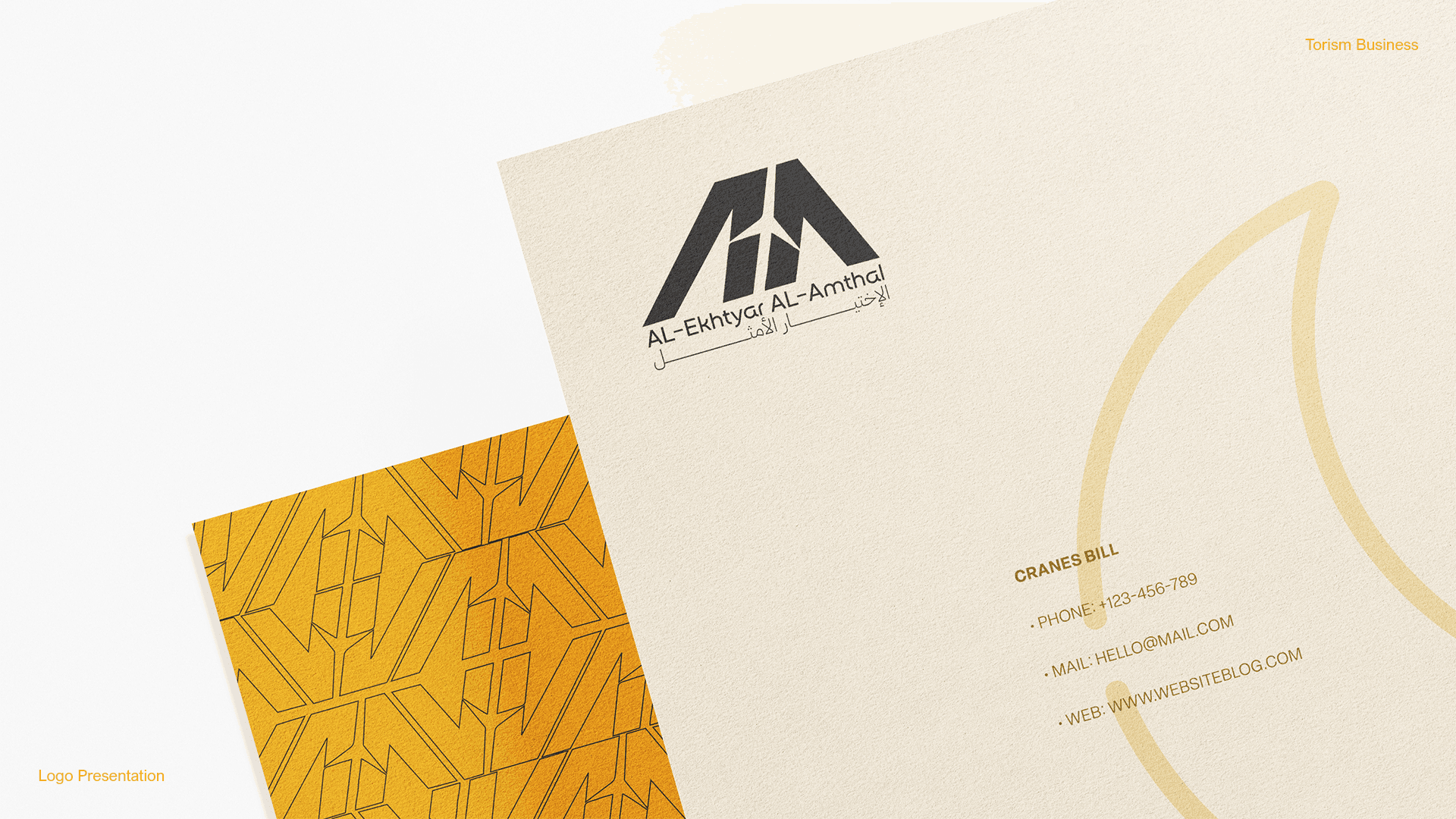
Brand Foundations
Establishing a clear, confident visual language.
Visual System
A flexible system built to scale across formats.
Consistency at Scale
The same identity, applied with discipline everywhere.
Applied Across Touchpoints
From concept to execution, ready for real use.
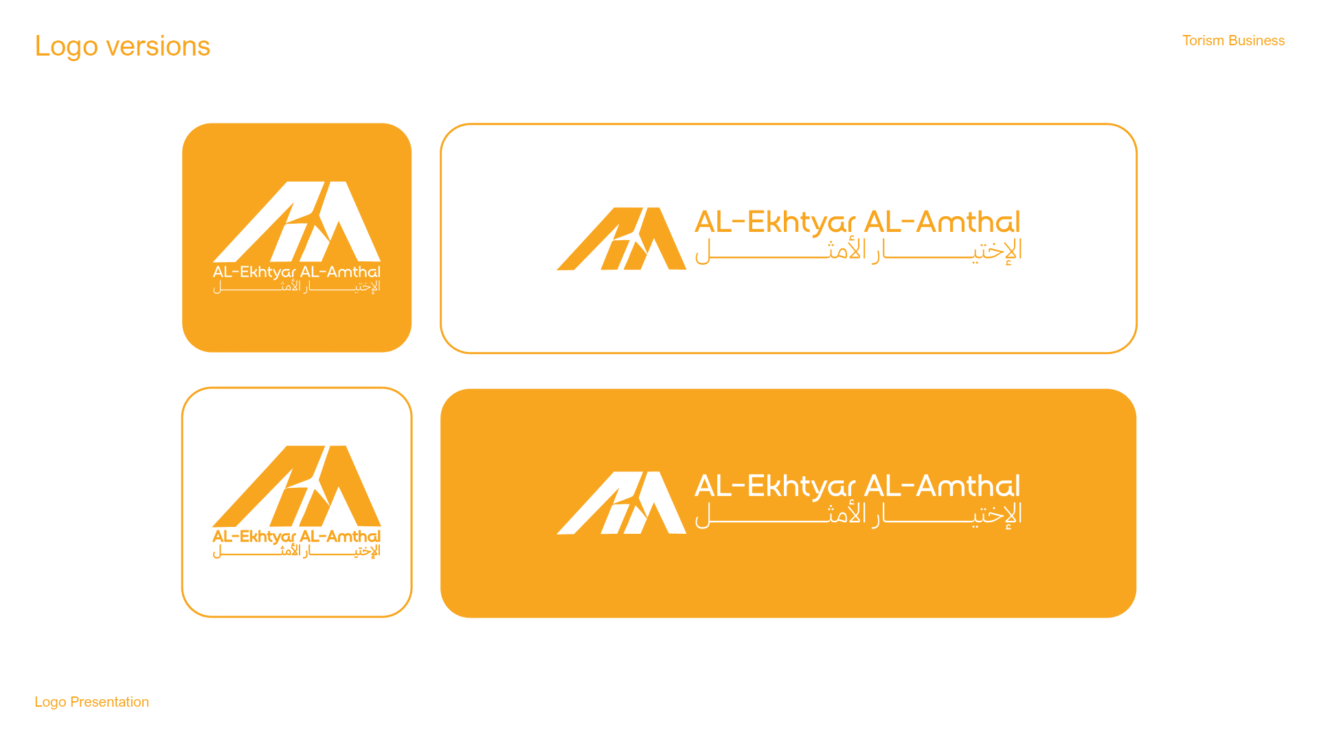
Impact
A distinctive, scalable mark ready for all print and digital collateral, positioned clearly outside the sector’s visual clichés.
Deliverables
- Primary logo in multiple formats
- Full logo presentation deck
- Print-ready export files (AI, PSD, PDF)
Ready to build your visual system?
I take on a limited number of projects to keep the quality high.